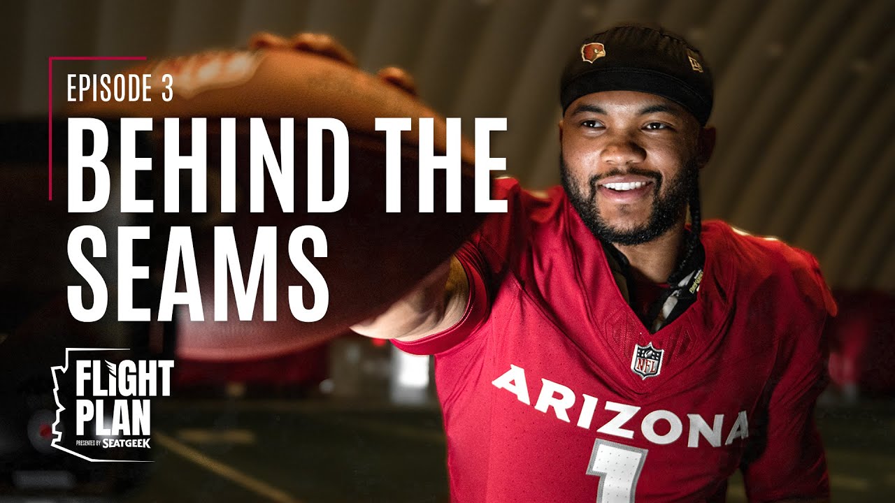
Cardinals Flight Plan: “Behind the Seams” chronicles the countdown to the reveal of the team’s three new uniforms. Hear the inspiration behind the designs and see how players like Kyler Murray, Zach Ertz and Zaven Collins embraced their new game day threads.
Flight Plan is presented by SeatGeek.
Subscribe to the Cardinals YouTube Channel: https://bit.ly/SubscribeCardsYT
Get Your Tickets for the 2023 Season: http://azcardinals.com/tickets
Watch #CardsFlightPlan: http://bit.ly/CardsFlightPlan
Watch #CardsFolktales: https://bit.ly/CardsFolktales
0:00: Cardinals Uniform Reveal Event
0:41: Uniform Inspiration
3:24: Nike explains the design
9:00: D.J. Humphries promo shoot
12:50: Players react to new uniforms
16:18: Meet Cardinals equipment manager
19:21: Players model new uniforms
#ArizonaCardinals #NFL #AZCardinals #BirdGang #FlightPlan #NewUniforms
Follow us on Instagram: https://www.instagram.com/azcardinals
Follow us on TikTok: https://www.tiktok.com/@azcardinals?lang=en
Follow us on Twitter: https://twitter.com/AZCardinals
Follow us on Snapchat: https://bit.ly/2W11u1g
For more Cardinals action: https://www.azcardinals.com/






34 Comments
I like the new jerseys even more learning the homage to the past and seeing all the work put into it I’m getting me the white and red jerseys they look so clean
They kinda terrible they could of added more designs like the flag
To many old generation people worked on that… no wonder the design became what it looks like.
The lack of Isaiah Simmons makes me wonder if he’s not part of future plans
i really wish they would have considered yellow instead of silver for the 3rd color and make the face mask yellow to match the color of the beak. It's also different from any other teams that also use red.
Needed more yellow. And red over white with striping on home.
My favorite thing about all the comments are all the people thinking they have any agency in this in the first place. Wasn’t our call. Uni’s are an objective step forward compared to what we had. Moving on.
I like the aesthetic simplicity. Not to mention, the designs should look nice if and when they mix and match tops and bottoms. The uniforms complement the helmets and the overall look isn’t overwhelmingly surprising but it does look good and it is a very nice look imo.
People were quick to hate on these from the jump but they are actually clean af, state flag woulda gone crazy tho maybe an alternate for next year with a tan/copper set👀
"They look clean"
Translation: they were cheap
"I love to honor tradition"
Translation: never plan to win a superbowl
Awful uniforms. Did a stripe kill the Nike CEO's child or something? Give us some damn stripes.
I know a lot of people are hating on the uniforms. But I actually really like them! The silver highlights are so nice, and the all white uniform is just clean bro. I love the cardinal red color and the fact that it was embraced for the home uniforms!!!! And the "bird gang" is just awesome.
The uniforms will grow on me but so so much could’ve been done with the uniform. Lol. I guess since they started covering players meals, our budget for uniforms was tight .
My boy K1 😂 I love that shiii
Those in that conference room sound completely uninspired. The uniforms have grown on me, but it does explain things.
So a woman reined these? No wonder their horrible.
The red jersey looks better with white pants.
Red = Oklahoma Sooners
White = Ohio State Buckeyes
No state flag???
You can change the uniforms; but you can't change the fact that the Cardinals are a bad football Franchise.
Huge fan of the new unis, lack of the flag inclusion is a little sad but all in all, substantial improvement. I also just love watching the interactions of these guys behind the scenes. Zaven is hilarious and it's such a neat look to see the players genuine reactions to them. You didn't need all that "fake briefcase" nonsense. The real reactions were much better.
As a fan Im dreading this season
I'm sorry but only Miami dolphins have uglier jerseys now, I literally like our old ones better. Why would you go new skool. Everyone including their grandma wanted the AZ flag with the Cardinals logo incorporated with it,.
but, once again cardinals disappoint the fans again.
Missed opportunities with the uniforms. Sucks we have to wait 20 years to get new ones
The biggest L is building this like you're blind……this looks like practice jersey. Another L for bidwell. Garbage.
Def Nike sent the B team to redesign this….for God sake. Oregon should have designed it for you guys.
So someone got paid 40hrs a week to design that
LOL
I personally, really hate these jerseys. I am dreading the fact that we are stuck with these for the next 10 years or more…
Poverty uniforms for a poverty franchise
Still the only uniforms in Arizona that have nothing in common with Arizona
Shoulder numbers on the white and black uniforms would have taken them to another level. Red socks to break the monochromatic look. The reds should have been the inverse of the white.
Whatever camera they used to live stream the reveal did not do the uniforms any good. From seeing them in person, they are absolutely fire but I do wish the incorporated the state flag but overall an upgrade from our last uniforms
This what happens when u let old people decide what’s gonna be stylish for a young people sport!🫣🫣😳😒😒😖…they gave us our old classics uniforms with other teams designs 😶🫠🫠…and they really sat there satisfied with absolutely nothing I don’t know why they closed the door like that before the reveal, I bet the janitors wearing something better than them stell as uniforms! I’m already tired of them can’t wait until 2063 to see our next round of new uniforms #2063gottabebetter 2:49
Honor what tradition????Losing ?????? #2063uniforms gotta be better 😣😩🫠 2:53
You can see when they gave up deleting the comments in here. 95% of the fans are disappointed in these uniforms.
Not even watching these anymore. Just came to comment. Bye yall.