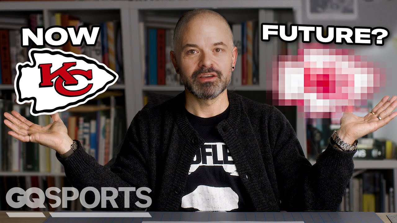
What does it take to rebrand a huge sports team? GQ finds out. Join Justin Thomas Kay as we look at the evolution of the Kansas City Chiefs’ branding ahead of Super Bowl LIX, from their founding logo as the Dallas Texans to the most recent Chiefs’ hallmark. What are the key ingredients to a team logo in the NFL? Did the Kansas City Chiefs get it right? What could the team’s future branding look like? GQ settles the score, as the Kansas City Chiefs get rebranded.
#KansasCityChiefs #Chiefs #SuperBowl #SuperBowlLIX #SBLIX #NFL #GQ
GQ Sports recommends:
Watch more from GQ Sports:
With GQ Sports, the real action is off the field. Get an all-access pass to the world’s coolest, most stylish athletes with original series like My Essentials, Actually Me, My First Million, Game Points & More. Watch a GQ editor try his hand at pro sports in Above Average Joe. And get an all-access look into how athletes shop, train, travel, and showcase their love of style, menswear, and sneakers.


30 Comments
Lebron The Goat
Patrick Mahomes will be the goat
KEEP THESE COMING
Love the vid, do Chelsea next or another fotballteam(soccer)
This is really cool, keep doing these! I’d love to see the ravens!
Honestly not a fan of this rendition.
fire dawg
this is so ziggidy shmee durrrrrrrr jaysen,
need more
These videos rock
Please do the Washington Football Team
do the San Antonio Spurs! or Ajax football club
Sigh … I don’t mean to be a hater but this ‘rebrand’ has weakened almost every aspect of the current logo without significantly improving any single aspect.
– the arrowhead shape has been unnecessarily distorted to be a rougher and less clear arrowhead shape.
– The black outline has been thinned which simply reads worse at small scale / greater distance.
– The letterforms have also been thinned and look extremely wonky and unbalanced in terms of thicknesses. The shadow has been made more accurate but to what discernible improvement? The letters now have less impact and look unquestionably worse.
I will say making the extended typemarks uniform helps – should have stopped there.
If a ‘rebrand’ isn’t noticeably improving on what is already in place, it’s a wasteful exercise as is sadly the case with this effort. Unlike the first episode in the series, this is not an odd sidestep but rather a definite downgrade.
Great job. Do the Nashville Predators next.
Pulling for the Eagles. Tired of the refs bailing the Chiefs out.
Please help the Carolina Panthers. They need a new logo.
Love the content, do the Dolphins cause that logo is atrocious.
you really wasted a 20 minute video to make a logo that's almost exactly the same as the original. actually I think it's a little worse. what a waste of time.
How about resurrecting the Seattle Sonics? Overdue to be reinstated into the NBA and would be interested to see your take on
Do the Cowboys next. I want to see you re-invent the star.
I like the idea of the series, but none of the end results look better than the current designs.
Enjoyed the video, but the OG is better. It's been unchanged for decades…..hard to top it.
Waste of my existence
Plzz do the Charlotte Bobcats or Seattle Sonics
As a graphic designer, not a fan. In the KC logo you can see where the C is skewed towards the top making the drop shadow look thicker than it needs to be. Made something that was timeless worse.
Do the Steelers next
I enjoy the conversation around logos like these, but this truly feels forced. That new arrowhead is *rough*.
I like the simpler font family, especially in the logo, but I think the current iteration is made much better with the thickness of lines. I do prefer the white exterior line but if the shadows and interior black line were heavier it would maintain that very classic, retro-feel, while making the brand identity clearer. Not the biggest fan of the uniform concept, though.
Would love for a patriots rebrand! I think using the original Pat Patriot and bring him in the modern world would be awesome to see!
Love these videos!