I love talking jerseys and uniforms, so join along if you want to see more. Not sure if I’m picking up any other Rivalry jerseys on the first run, but will hope for a Cardinals and Seahawks on sale later this year.
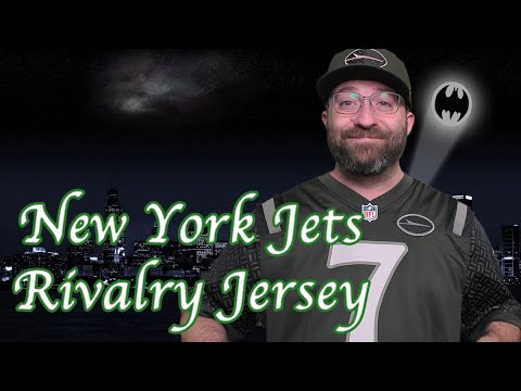
Look what finally arrived. Jets rivalries jersey and hat. Let’s dive into it. As they say, let’s start at the top. So, we have Gotham City football on the collar written in Times New Roman looking like the New York Times itself. For those of you who are not aware, Gotham City is not just a Batman thing. Gotham was actually a town in England inhabited by fools, they said. So in the 19th century during one of the I believe Washington Irving wrote a paper or some type of novel, a book something where he was describing the fools in New York City as Gotham City. Um that was the first time it was used. So over a hundred years before Batman used it. Over here we have, as a lot of people know, the design on the shoulders, uh, the sleeves and the jet itself. The background is meant to represent a manhole cover. Those have the raised designs like that because it actually makes the manhole cover easier to cast in the iron. Also add some grip for the people and for the uh for the people traversing over the top and for the people that have to open them and use them. There we have the modern jet logo. It shows like a stealth bomber type jet. The Jets were named in 1963 because of the start of the jet age. You have to realize when the Jets became a team, we didn’t even land on the moon yet. So flying by jet coast to coast and all that stuff was still pretty brand new. So they wanted something modern, something exciting. The Jets were playing at Shea Stadium at the time, home of the Mets, and that was positioned between the two major airports in New York, JFK and LaGuardia. So, hence the name Jets. All right. So, get the full front of the jersey. Even the numbers have that beautiful Gothic tone. I love the way that my complaint with older Jets jerseys was that on the on the shoulder stripes here, the colors from the third stripe to the shoulder itself or the the uh sleeve would match and it would just it wouldn’t look right. So, here it’s a subtle difference. It’s nice. And as you can see, I have a nice 4K camera here. It’s uh it’s actually it’s not black as everyone’s been saying. It’s a really dark green. It’s a new color for the Jets. I find that their current jerseys are far too drab compared to what they should be. It should be more of a space age green. But it this being a rivalry special uniform, I think it’s pretty awesome. Let’s check out the back real quick. Okay, starting with the back. Here we have a lot of people might be making fun of me for getting a Justin Fields jersey, especially as he just was concussed, but I believe in the young man, and I’m excited to collect jerseys sometimes. You know, it’s uh I believe in him. I think he’s going to have a good year once he gets back on the field. But the number has that same font to it. I think if I only had a complaint about this jersey, it’s that as you can see over here, the Nike swoosh is seemingly in white. But the number is in the weird like not weird but this off color over here. I don’t exactly know how to describe it. Um so it almost feels like these two should match. But other than that, I really enjoy these jerseys. I don’t know if I’ll pick up any others. I’ll probably wait for a sale to pick up. I I really like the Cardinals one. The Seahawks is awesome. I can’t see myself getting a different AFC East team. So um we’ll see. Have some fun this weekend and go Jets. Take care.

